在vue项目中安装
1 | npm i echarts |
引入
1 | import echarts from "echarts" |
使用
html
1
<div id="echars-container"></div>
js
1
2
3
4
5
6
7
8
9
10
11
12
13
14
15
16
17
18
19
20
21
22
23
24
25
26
27
28
29
30
31
32
33
34
35
36
37
38
39
40
41
42
43
44
45
46
47
48
49
50
51
52
53
54
55
56
57
58
59
60
61
62
63
64
65
66
67
68
69
70// 这是一个vue的方法
drawLine() {
var wid = $('.line-box li').eq(0).width() / 2;
console.log(wid, 'wid')
// 基于准备好的dom,初始化echarts实例
let myChart = this.$echarts.init(document.getElementById('echars-container'))
// 绘制图表
myChart.setOption({
grid: {
x: wid,
y: 20,
x2: wid,
y2: 20,
},
tooltip: {
trigger: 'axis',
//在这里设置
formatter: '{a0}:{c0}万'
},
xAxis: {
show: false,
type: 'category',
boundaryGap: false,
data: [],
},
yAxis: {
show: false,
type: 'value',
min: 'dataMin',
},
series: [
{
name: '最高气温',
type: 'line',
data: [19, 11, 10, 13, 12, 13, 10],
itemStyle: {
normal: {
label: {
show: true,
formatter: "{c}°",
position: 'top'
},
color: "#fff",
lineStyle: {
color: 'rgb(40,177, 205)'
}
}
},
},
{
name: '最低气温',
type: 'line',
data: [4, 4, 2, 1, -10, 7,3],
itemStyle: {
normal: {
label: {
show: true,
formatter: "{c}°",
position: 'bottom'
},
color: "#fff",
lineStyle: {
color: 'rgb(251, 201,0)'
}
}
},
}
]
});
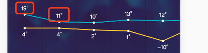
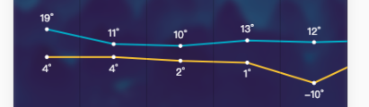
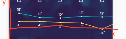
}效果为
设置
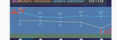
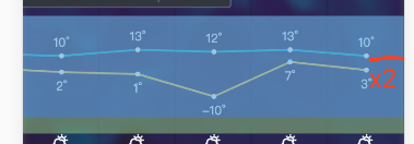
- 图表距echarts容器上下左右的留白,注意这里的距离是从图表的边缘开始的
1
2
3
4
5
6
grid: {
x: wid, //wid变量
y: 20,
x2: wid, //wid变量
y2: 20,
},
- x轴和y轴 坐标轴的设置
不展示1
2
3
4
5
6xAxis: {
show: false,
},
yAxis: {
show: false,
},
y轴的基准线有最低的数值决定,默认是0,解决数值相差较大的情况下面留白太多1
2
3yAxis: {
min: 'dataMin',
},
x坐标轴设置的值都显示
1
2
3
4axisLabel:{
interval: 0,//让所有坐标值全部显示
rotate:30,//让坐标值旋转一定的角度
}折线的设置,在series里设置
折线颜色和小圆点颜色1
2
3
4
5
6
7
8
9itemStyle: {
// 折线数据拐点处的小圆点的颜色
color: "#fff",
// 折线的颜色
lineStyle: {
color: 'rgb(40,177, 205)'
}
}
}
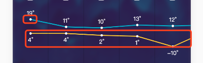
为每个折点数据添加单位,数据的位置1
2
3
4
5
6
7
8
9
10
11
12
13itemStyle: {
normal: {
label: {
// 让折线处的数据展示
show: true,
// 为每个折线的数据添加单位
formatter: "{c}°",
// 设置折线处的数据在折线的上方
position: 'top'
// position: 'bottom' 设置在下方
},
}
}